Showing posts with label design. Show all posts

Thursday, September 8, 2016

Process, paint and thought

14 x 11 inches Acrylic on wood panel


Day 8 of the 30 paintings in 30 days challenge.  A good friend of mine makes wine and uses photos of her pup for the label.  She was kind enough to give me a bottle of her latest batch.  So thought it would be nice to give her something back.  This painting is for her. Thanks Deb.
But thought I would share the painting process of this one with you.  I started out just planning to paint the bottle, roughed in the form and built up the layers with acrylic paint on a wood panel.  But as I went along it need something to add some more interest and balance the composition a bit.  Thought adding the pup peeking over the table was just the ticket.


Saturday, July 25, 2015

Early change

Poppies in a Daisy Vase, Oil on canvas panel, 10 x 8 inches
Starting out an oil painting with an underpainting is a great way to see how well the composition will work.

The first idea was to include a seashell with the flowers.  But after looking at the lay-out, the shell added nothing to the composition. The shell was too centered and actually distracted from the flowers.  At this point the changes were easy to make, to complete the painting.
Just bought I would share the idea, do not be afraid to change your plans, and earlier in a painting is much better than later.
Mary


Saturday, November 16, 2013

Sharing the process


Thought I would share the steps involved in making my latest seascape.  
"A Dusting of Yellow"  Oil on canvas,  9 x 12 inches
                                 Available at DPWs


I started with a combination of texture and color combinations.  The texture is a mixture of oil paint, pigment and egg yoke, this mixture is nice because it dries at the same rate as the rest of the oil painting.  I put down my dominate color of blue and a point of red as a focal point.

Then a layer of yellow high light is added to bring back in light and warmth.    
The third step was to develop structure.  The last step is to refine the painting over all.

Mary

Friday, October 25, 2013

Rearranging objects with oil paint

I am taking another oil painting class from Timothy Widener this year, an excellent artist and instructor.  But today I just was not in a classical painting mood.

Oil, 12 x 16 inches 
I got to class and as usual he had some beautiful still-life set ups ready to go.
I looked them all over picked one that interested me, set up an easel and couldn’t get going. 
 So I pulled out a sketch book I had in my bag, ( full of abstract designs) and one simple layout caught my attention.

When I fill up a sketch book I always paint the cover :)

Looking at the still-life and the sketch I got my brushes moving, and started having some fun. 
 But the best part was when Timothy came over to see what I was doing, actually had him at a loss of words for a few seconds. But then I got a smile and chuckle from him.
What I had decided to do was combine the colors from the still-life, the layout of my sketch, and try and represent different surfaces, like the glass, something fuzzy like a peach, and metal.  It was a fun experiment for the day.

   By the way Timothy has an excellent book available; "Painting Light and the Impressionist Method"

Mary
(I also have a book on Blurb, of Still-life paintings)

Sunday, November 11, 2012

The Look

Completed oil on Ampersand panel 14 x 11 inches

                                            Available in DWP auctions


Painting involves a lot of time spent just looking.  Looking at the subject, understanding the light, shadows, shapes and colors, because after all those are characteristics make a good work of art. 
    Often, after finishing a painting section, I set the painting somewhere to view easily.  And after looking at it for awhile,  I decide it is done, other times there is a growing feeling something is missing.  Having the painting somewhere I can view it at different times of the day, under different light and with different moods the missing part becomes obvious.
   This painting is an example, I loved the subject and the colors and thought I was done, but after a few days got that feeling it was missing something.  Then it became obvious the composition was missing something…balance.  I added the flower and it felt complete.
   So take time and really look at your work, it sometimes has more to tell you.

Before...
and after.


   Here are the before and after pics...

Sunday, September 23, 2012

Second Ink

   
Acrylic on paper, 20 x 16 inches


     Still working with the quick ink sketches I posted last time.  This is the second one.
Worked this up on red gessoed watercolor paper, and pick only primary colors to experiment with.
This is just one option, and I plan to try different variations to the way I paint it, but you need to start some where.  While I was painting, the thought of  "disconnected  conversations" kept popping into my head. I may later follow up on that idea.  It is always a good idea to jot down the ideas that can give a future work a direction to follow, that can be as important as the sketch.
Hope that sharing this process, encourages new ideas and gets painters to get those brushes going:)


Sunday, September 16, 2012

The Process

Oil 16 x 12 inches
Ink 7 x5 inches


    Art is always on my mind.  And the only way to deal with an obsession like that is to learn to live with it.  When the TV is on, I am doodling, when I go out there is always a small sketch pad with me.  Even when I get ready to sleep there is a sketch pad near the bed, for those times a picture pops in my brain just as my eyes are closing.
     Because I have learned to grab ideas when ever they happen, I always have a source to work from when real time allows.
   Thought I would share the start of one of these ideas.  The sketch is on a small 5 x 7 drawing pad, one of many I did while pretending to watch TV with my husband.  When I had the time to get some oil paint out, instead of sitting and trying to think of something to paint, I accessed the nearest sketch pad and picked the first one that caught my interest.
   The Painting is on watercolor paper 140 lb that was gessoed with orange colored gesso.  I keep a small pile of prepped paper handy.  This is a working idea now.  The small painting is complete, but also may lead to a larger work.  

Monday, May 28, 2012

Art Series


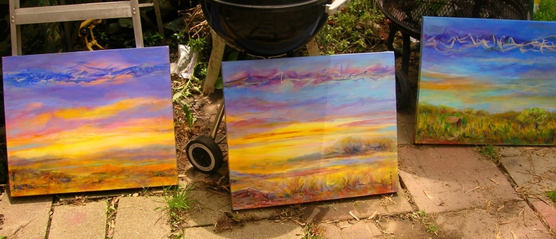
the 3 completed, lined up out on the patio 


I made a resolution this year to paint in series of three.
Some times I end up with 3 paintings that are wonderful and go well together.
Other times it takes 3 tries to get what I want.  So far I am learning a great deal from painting this way and plan to keep working with this practice.
   With my last series of three, I ended up two that are perfect together and one that got painted over.  But even with the one that didn’t work out, it started me in another direction. 
  The two I like I call more sky writing, the idea that everything about the world is there before our eyes, only in a language we can not read yet.  The one that I painted over fell away from that direction and frankly reminded me of a bad Bob Ross painting.  But after painting over about 2 thirds of it I saw an ocean pattern developing and decided to start writing by waves.
    
Mary's websites:
Artavia       Fine Art  
   Artmajeur


the 2 keepers


last look before saying good bye
painting over what I did not like
the remake in process


Sunday, February 26, 2012

Drawing Ideas


When I am not painting, I usually am working with pencil and paper.
My favorite drawing pencils are Derwent Inktense, they are colored pencils that when you paint over them with water take on an intense colored ink appearance, and once dry are permanent. Places that you can find these pencils are; on line at  Dick Blick  http://www.dickblick.com/products/derwent-inktense-pencils/ and locally at Boundless Arts in Grand Blanc MI  http://boundlessarts.com/ .
      Some of the sketches I use as reference for future paintings, others are finished art, and still others become subjects for digital art.  An example is the red and orange tone drawing, that I photo copied and changed colors on my PC to see what a different version would look like.  The digital image looked so good on it’s own that it became an art work that I loaded to my web site; http://fineartamerica.com/art/digital+art/schiros/all 
For more examples of digital art check out Digital Art on Fine Art America.


original drawing

Photo shop changes to original

Sunday, December 4, 2011

Cat Printing and Musings on Art


Cat helped printing
The Cat Artist…..I just want to share the finished work from my last post.  Also, sharing the secret of how the last print was completed.  I started with a red printing of my design and planned the second layer to be a light teal color.  I completed 12 prints that I proudly set a side to dry, when my crazy domestic Bengal cat managed to sneak into the studio and proceed to pounce on the drying pile of prints.  Six prints survived and 6 others had a variety of paw prints added.  After chasing my four legged painting partner out, I gather up the ruined prints and started to throw them out.  Throwing out art work in hard to do and I just could not let them drop in to the trash can.  So, I rolled out some fresh black ink and added one more layer.  Well, I guess my cat had a better plan than mine; the last six prints are now my favorite.

test print of the top layer
where I had planned to stop
printing over a mono print, there is a cat under that top pattern
My musing for the day….It is interesting looking at the printing I have been doing, I think the designs could be worked up in photo shop or cut and pasted from glossy magazine art.  But, the process of carving the lines and rolling the ink is what makes this art work.  Viewing the work you can see the texture of the ink, that slight rise and sheen that it creates and that is the character of relief printing.  I just hope that young artists don’t get cut short by technology and miss the process, that part of creating that comes only from working with ink covered hands.
And I always finish my printing day with a finger paint mono print from the left over ink.


Tuesday, November 29, 2011

Take it and run with it

first printing


Take it and run with it…

Recently I took a Zentangle class, if you are not familiar with that, it is a form of ink drawing, based on patterns.  I was not sure where it would lead but found the process interesting.  Working with the ink drawings has managed to lead to new ideas, and that is why I love to take class and workshops when ever I can. 
   The class had a project of that involved drawing with white ink on black paper.  Look at the designs from the class I noticed that those patterns would make a good template for ink relief printing.  The reason for that is when printing you have to think in reverse of what the final print will look like.  Thought I would share some pictures of the process and where it is leading.  These are just the first in a series of ideas that will end up as finished art works. 
   Hope this inspires you to try some new projects.  For more information on Zentangle check out; http://www.zentangle.com/, an look for friends of Zentangle on Face Book.

white ink on black paper

rough lay out for print plan 

foam printing plate

another plate for print

first inking of a plate

idea

idea

idea

and yet another idea


Thursday, September 29, 2011

Fall Season Art

Fall Leaves Ink 1
 

I Love Fall

When the leaves start falling, it is time to start those wonderful fall pictures.
A few days ago, I gathered a few leaves of various shapes and put them in books to
flatten then out and get them a little dryer.  When I had some time I spread them out on
Arranging leaves to trace on paper
drawing paper, in random arrangements and traced the outlines, some over lapping others
to make it interesting.  Then I got out my favorite ink markers, a mix of Faber-Castell Pitt
pens and Picma Micron by Sakura, both are permanent and don’t tend to bleed through
the paper.  Then just took my time creating interesting patterns in each shape.  These drawings help me to focus on composition and pattern.  I limit the colors to keep my focus there.  This is an interesting and relaxing exercise that makes some unusual works of art.  Latter I will use this idea but use some watercolor paper that has been already painted with fall a background in fall colors.  This is a fun fall project, now go collect some leaves and give it a try.

one out line arrangement
Another outline arrangement. pencil on drawing paper


Starting to fill in shapes with patterns
Fall Leaves Ink 2, 11 by 14 inches