Friday, December 26, 2014

Complements

12 x 12 inches Acrylic on stretched canvas

                                                                 Click to Bid

This is a work in complementary colors,  probably my favorite way to use color.  What is great about a limited palette of opposite colors is the type of gray that you can mix.  The clouds and the saddle are just mixes of red and green and white, that make wonderful grays and also a neutral violet.  When I noticed that violet in the shadows on the horse one more color was needed to finish the work; yellow.  Adding the yellow gave a nice pop to the colors and also made a new set of complements in the painting, yellow and violet.

Mary

Saturday, December 20, 2014

Memories

It is freezing here, Winter in Michigan is beautiful but very very cold.  So the last few days I have been thinking about last Summer, and decided painting a few Summer paintings would warm me up.
    This one is from a photo in Linden Michigan, at the Mill-pond in town.
14 x 11 inch oil on wood panel  The Cruise
    This one is of one of my cats "Boots" out in the yard on sunny Summer day....
Oil on canvas 16 x12 inches
Shadow Walk

                                                                      Click to Bid
Started Boot's painting with a combination of tone and underpainting....

   The yellow underpainting is a great way to add extra warmth to a painting.....just what I needed :)

Mary

Monday, December 15, 2014

A Change of Mind

"A Natural Still-life"  Oil on panel, 12 x 9 inches
Click to Bid

   I know one should have a firm idea in place, a plan, or outline of what is to be done.  At least that is what I have been told.  And I often do know exactly what I plan to paint....but not always.  In this case I had a textured panel all set for a landscape, and I started that way, (more than once).
   I started a landscape did not like it, wiped it off, then started a seascape...really did not like it, and wiped off the sea.  I decided I was just not in the mood for land or sea that day, but still felt like painting.  I just finished Carol Marine's newest book and thought I would try one of her suggestions to paint forms thinking of them as islands.  Painting by islands is basically to work from the middle out.  So I started with the apple, then moved on to the vase and flower, planning to do the background last.  Well I changed my mind when I saw how the still-life looked and fell in love with that sky behind it.  In fact I think I see a future series here :)
  Sometimes a change of mind is a good thing.

Mary

Wednesday, December 10, 2014

Why not?

14 x 11 oil on panel, "Tulips 5"
                                                                             Click to Bid

     Being fairly new to oil painting, I have noticed that different painting mediums produce different styles.  I started in watercolor, then worked in acrylics and now oils.
 I was looking at a set-up I had ready to paint, and thought it looks like a watercolor subject, but what I had out were oils that day.  So I ask my self..."why not paint it with oils like I would a watercolor".
     I guess I just gave myself permission to try something different and so glad I did!
So "why not?" is going to be one of my new sayings when I pull out the brushes :)

Mary

Wednesday, December 3, 2014

Making a statement with art

6 x 6 Oil on wood panel

My painting for today.  Yes it makes a statement.  Statements do not have to be Earth shaking, they can be small and simple.  I love old fashioned light bulbs!  I really, really hate those curly bulbs.
Sweet and simple, my statement for the day.

Mary

Sunday, November 30, 2014

Thinking with watercolor

A good habit I have been trying to develop is working up an idea before jumping into painting on the canvas.  With still-life oil painting I usually do a small 3 x 4 inch black and white sketch, these cartoons help with developing the compositional lay-out.  But sometimes an idea needs more and that is when watercolors are perfect.

I had a photo from last summer, of morning light at the edge of a tree lined stream.  I want to paint it in oil but just did not know where to start.  So I did a quick wash in watercolor to get a feel for the colors.
Liked the rough wash so kept going.....
"Light at the Creek Bend"  14 x 11 inches
Available at DPWs
Working with the watercolors is a natural way for me to determine tone and edges, possibly because it is the medium I know the best.

After finishing this one, another idea came to mind, with all the materials out and ready, I just kept going.
16 x 20 inches watercolor
"Contemplation of Each"
With this one I wanted to see how hard it would be to free hand a mirror image.
Not a perfect (or even close to it) mirror image but it was great practice!  There was something fun and interesting about trying this, I was tempted to work with a brush in each hand....huh 
Think I see my next experiment :)

Mary

Saturday, November 22, 2014

Cats, cats and more cats

A friend ask me to paint her daughter's cat.  I told her give me photo and I will work one up.
Well I got a couple photos, and they are "challenging" photos :)  Decided to dive in and give it a try.
Because the photo was a little rough, decided to go to my comfort zone media;  watercolors.

Pulled out a full sheet of watercolor paper, divided it into quarters, and just dove in.
Have a personal favorite out of the first 4 paintings,  and found myself really enjoying working with the watercolors.
Having fun and not really sure this was one my friend would like, pulled out another sheet, divided it up and did some more.  Also decided to work up at least one of my photos for my self.
By the time I was on the second sheet, ended up with two that my friend will probably like.
By now I was on a roll and just wanted to keep going....
Think my friend did me a favor,  got me going on watercolors that I had been ignoring for some time.
This is where I stopped today.
11 x 14 inches, Over the Shoulder.
Added this one to my DPWs site.
Mary


Monday, November 17, 2014

Using all the paint

When I am painting there is always paint left on my palette.  If it is acrylic, no big deal, let it dry and peel off the paint skin for collage work, watercolor let it dry it can be rewetted later.  But when it is oil I just have to do something with it.
Sometimes I start a new painting using the left over for my rough sketch.  Other times I just play.  The photo above is an example, some doodling with left over oil on some Arches oil paper.  Kind of liked it it so I saved it.  After the next painting I finished added that left over oil to the doodle....
So far so good, did the same thing after another painting.....
Ok now this doodle is getting serious, decided to finish it up as a painting...
Once this is dry I plan to mount the oil paper to a panel.  That is unless anyone has any info on how to frame Arches oil paper, I am new to this material.  Any suggestions please send them my way, would be greatly appreciated.
Mary
Schiros-art.com


Saturday, November 15, 2014

About Alkyd Oils

"Sunflower Mini" Oil on canvas panel, 7 x 5 inches
Click here to bid in auction


Thought I would share my views on Alkyd oil paints.  Alkyd oils are fast drying oils that I enjoy.  After painting for many years in watercolors and acrylics, the drying time for oil painting drove me a bit crazy.  Alkyd oils dry  to the touch in a day instead of several days.  After finding these paints I tried several types; Gamblin FasMatte,  C.A.S.,  Griffin Alkyds, and Da Vinci.  Each has pros and cons.
 
My favorite is C.A.S AlkydPro.  CAS has the highest pigment load, a professional level.  The paint is smooth and creamy and has mediums available for thick application.  The oil base is a sunflower oil alkyd resin which I prefer to linseed.  CAS is also the fastest dry of the brands I have tied. The down side is paint will form a film after opening.  You will need to keep a large nail handy to brake through the film with following uses.  Copper study was painted with the C.A.S.

My Second favorite is Gamblin FasMatte.  The pigment load is a bit light than CAS, but the paint dries to a matte finish, which visually makes it easy to determine color.  FasMatte dries completely matte but you can finish it with any varnish you like and change that you choice.  Sunflower Mini was painted with the Gamblin.

Next is Griffin Alkyds,  there is a noticeable difference in pigment load, about if you are use to Winsor Newton paints it would be fine.  Griffin has a semi gloss finish when done.  On the bright side they are the most reasonable priced.

The last brand is DaVinci,  I was not satisfied with this brand because I noticed a slight color shift after drying, and I am very fussy about color.  Not all the colors shifted, seems to mainly be a few of the blues.

If you are an Acrylic painter thinking of trying oils, but avoid it because of the drying time (like I did), this type of oil paint my be something you will like.  

Tuesday, November 4, 2014

Sparking creativity

Dusting of Rose, acrylic
If you ever need a spark to get yourself creating,  just start sorting your art supplies.   I set out the other day to clean and organize my studio, and before I knew it I was painting.  Found some paint I had forgotten about called Polycolor.  It is an unusual paint, the best way to describe it is slick.  I did a quick sketch and while it was wet, did a mono print of the the paint sketch.   Polycolor is thick and wet enough it worked well for mono printing.
 Then I proceeded to work up both paintings.
Rose Red, acrylic on watercolor paper
What is fun they both ended up different even thought they started from the same paint sketch.

One word about polycolor, I like it because it is slick and yet a strong covering paint,  but it does separate and needs to be mixed before you start painting.

Mary

Monday, October 6, 2014

Plein Air painting

"First Light"  11 x 14 oil on canvas panel
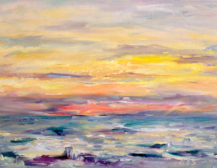
    This year I have been doing some plein air painting, and one day got up at 5 am to capture the sun rising over one of the Great Lakes.  That day I was at lake Huron, from Michigan you see beautiful sunrises on this lake.  If you want great sunset views, Lake Michigan is perfect.

     Thought I would share some tips from this experience.
1.  Get up early enough to have that morning coffee, before heading out :)
2. Get to the place you plan to paint from early enough to set up and have everything ready "before" the sun comes up.
3.  You may want to have a portable light, because you will be setting up when it is still fairly dark.
4.  Have you palette loaded with all the colors you want to use, and possible some premixed combinations that could be used.
5.  Be ready to paint "fast".
6.  Do not get discouraged if the painting does not turn out perfect it will make great reference to work from back at your studio.

      I list all these because I did not do them and really wished I had.  When the sun comes up it is like a slow motion explosion.  The colors in the sky and the water change "very" quickly.  I was still trying to get all my stuff out and set up in dim light when the light started to break.  
    When I started painting there was not enough light to clearly see the colors on my palette, luck for me I have a regular lay out I use so I knew where each color was.  But a small light focused on the canvas and palette would have help.

     These two were made on the beach that day, the one above,  was painted later using the plein air paintings as a reference.
This painting will be available at the Oct Fenton art show:

11 x 14 inches, oil on canvas panel
Happy painting Mary

Tuesday, September 30, 2014

Day 30 of the 30 in 30 challenge

10 x 8 inches, oil on canvas panel,"The Muses"Available at DPWs
The last day of 30 paintings in 30 days, thought it would be fun to share my Muses.  I have 2 troll dolls that sit on top of my easel, when I am frustrated all I have to do is look up and they always give me a smile.  The two little trolls are my reminder,  life is just too short to stress out over the little things.  Painting is fun!


Mary

Thursday, September 25, 2014

Encaustic painting

Day 25 already!  
8x8 inchesAvailable at DPWs
     I think I have mentioned this before, I am an art supply junkie.  If there is something new I have to try it.  This one is painted with cold water soluble wax paint called Ceracolor.  I call it encaustic because it is wax, but you do not have to melt it.  Pretty cool to work with.

   I have work with tradition encaustic and enjoyed it, but it is complicated, with heating the wax, melting it to paint, scraping back into it, and doing that to every layer you work on.  With traditional encaustic you can create more texture than with the cold wax.  But, the Ceracolor paint is just plain easy, wet it, paint with it, and heat it only to seal it.  Kind of feel like I am cheating...almost:)

    The painting is a location in Parshallville Michigan, an old apple mill that is fun to visit in the Fall.  There are trails from the mill that travel a long the small river by the mill.  A nice place to walk, paint and photograph.  One word of warning, on a warm day in the Fall, there will be bees, they are drawn to the area, think it must be the smell of cider and doughnuts:)

Mary


Tuesday, September 23, 2014

Finding time to paint

Started this early with a rough acrylic underpainting.  Working with gesso and some magenta color is a quick and loose way of putting down a composition idea.
Purple Passion, 8x8 inches, Acrylic on canvas panelAvailable at DPWs
After canning up 6 quarts of garden veggie soup, I went back and added the green leaves and darker accents.  This was a multi tasking day:)
Mary

Monday, September 22, 2014

Oil painting today....

10 x 8 inches, oil on panel, "One In One Out"Available at DPWs
     Planned to do a lot more on finishing this paintings today,  but after spending some time just sitting and looking at it, decided there was not much I wanted to change.   As a painter I spend much of my time when painting just looking.  Looking at the subject, looking at the painting.  Think that is what I love about painting from life, there is a kind of meditation that goes with it.
    I realized that I really liked the soft feel this painting has so just a bit of glazing to bring up the color of the roses was all it needed today to call it done.
   Did the under painting with a new color Greenish umber by Utrecht,  really like the color for laying out the composition and also to create a dark neutral color for dark accents.

Mary

Sunday, September 21, 2014

Painting from memory

Finished this 3rd week of 30 paintings in 30 days having some fun.  I have been painting a view I saw briefly while driving down a road.  One thing I learned from this is a memory is just an idea,  not a true reference.

Day 21....
6 x 6 on Ampersand panel

Day 20 and 19...

The 3 are available on my DPWs web site, pretty much just for the cost of the painting surface, thought it would be fun to just share the little experiments a t a fun price.

While I was having fun just had to do a little digital play also..

There is a web site called Collage.com that you can create collage collections from photos, another fun place to play:)

  Next week I plan to get a little more serious and finish each day some paintings that I have started.
I have a rule for myself, always have something in process, that way when I get up there is always something waiting for me to work on, it is a good way to keep painting everyday.
Mary

Thursday, September 18, 2014

Day 18 ...already

I started the underpainting for this yesterday, and enjoyed finishing today painting at good friends studio.
"Tes for Two", Acrylic on canvas panel, 8 x 10 inchesAvailable at DPWs
This one of my many Teapots, ( I tend to collect them).  I did one underpainting in acrylic, and a second underpainting in oil that I may work on another day.  I always find it interesting how different oils and acrylic paintings look.  So it will be interesting to compare the two.

This is how this one started....

I like using orange for underpainting (adds a bit of a glow), also wanted to put down an idea for composition.   I change a bit from start to finish but still very happy with it.

Mary

Tuesday, September 16, 2014

Day 16 of 30 paintings in 30 days

Some flowers from my imagination today....

"Red on Violet"  8 x 8 inches, Acrylic on gallery wrap canvas.AVAILABLE AT DPWS
Wanted to play with some color and lines today.  Love painting on Gallery wrap canvas because you can carry the painting on to the sides, lets you have more than just a straight on view of the art,  And you do not have to frame it :)
Past the half way mark in the 30 in 30 challenge, feels good.
Mary

Saturday, September 13, 2014

Day 13, Thirty paintings in thirty days

Another color threesome....
"Lime Light"  Acrylic on watercolor paper,  14 x 11

        I am finding it interesting how much variation in color can be done with just 3 colors and white.
The three today are Holbein Compose Rose,  Daniel Smith French Ultramarine, and Sennelier  Bright Yellow green.  
     The Bright yellow green is one of my favorites and I like the Sennelier brand the best.  There are colors that I will get only from one brand, just because that company seems to me to make the best version.  Cad. Orange I will only buy the Utrecht brand,  Utrecht produces many pure pigment colors.  Old Holland has a Violet Grey I just love. and Sennelier's yellow green is just right.  Some companies give odd names to colors, for example Holbein Compose Rose is actually a Naphthol red, and the yellow green is a mix of pigments.  If you want a quick place to see what the true pigment is in a color Dick Blick lists a tab "pigment info" for most of the colors and brands they sell, it is really helpful and I use it a lot, just for reference.
   The more you learn about color the easier it is to work with.
Mary

Friday, September 12, 2014

Some more red...

Finished up this painting this morning.....  Day 12 of 30 in 30
24 x 18 inches, acrylic on canvas, "The Bath"Available; original of print at FineArtAmerica

I know I am posting this late, but my day was busy with some of my favorite things: painting in the morning,  gardening in the afternoon, then canning in the evening.  Yes I like canning, something cool about growing your own food, putting it up for the Winter.  Kind of old fashioned but thats me.
    This painting I started at the open house for the Flint Institute of Arts, and it was painted with the same colors of the painting from yesterday. I worked on both paintings at the same time.  I find that working on 2 paintings will keep me from over working one.  I  taped several  1 and 2 minute gesture drawing on the wall in front of my easels and used them for reference.  One suggestion I can make is, if you ever have the chance to take life drawing please do.  There is no other form of drawing that will fine tune your skills as much as having to draw the human figure from life.
Mary

Thursday, September 11, 2014

Always say yes

A tip I have learned along the way....
   When ask to participate in an art event, (that is free and does not involve giving away your work),
always say: "Yes, I would love to!"  and say it with a big heartfelt smile.  Now after your turn and walk away with that smile on your face, you can then panic, and think now what!  There is nothing that will get you to your easel and painting, faster than having a event to be in.  
   Wed. I had the fun of being one of the active painters, on display at the Flint Institute of Arts, Art school open house.  After jumping in and painting in public for a while now, I have learned it is very rewarding.  I get to do something I love, be around people and paint, just doesn't get any better than that.  Now if your thinking I just can not paint in public, you do not know until you try, and if you don't try you will never know...(kind of  loop there).  Yes it is scary the first time, and yes you may make mistakes, but people don't care, they will enjoy it even if you make a mess...really!
   Anyways, here is one of the 2 paintings from the open house...
28 x 22 inches, Acrylic on CanvasAvailable for sale or prints at Fineartamerica.com
Counting this as painting 11 of the 30 paintings in 30 days challenge, because I did finish it up today.
Also, it fits with this weeks theme, limited palette, but I did use 4 colors:  Capital Orange by Matisse (looks like a cad.red light) and Haymarket ( looks like an ochre yellow) also by Matisse.  These to are called background colors, because they are opaque and mat.  I love these paints because you can put down a lot of rich color quickly.  The other 2 colors were Golden's Ultramarine blue, and Holbein Aqua blue.
Happy painting
Mary
Painting and chatting, and two easels, hey I can multi-task :)

Wednesday, September 10, 2014

Three more colors...

"Green Perch"  Acrylic on watercolor paperAvailable at DPWs
Today was a very busy day, but did one more color theme this morning.  Today I used a very scary color; Phthalo Blue, it was Daniel Smith brand, but brand really does not matter, Phthalo is a strong staining color by any brand.  The other two colors were Hansa Yellow Deep, and Quinacridone Violet both Daniel Smith brand.  The yellow was a strong enough color to mix with Phthalo, but I was surprised that the violet as transparent as it was.  I also use white, but do not count that as a color, just a color adjuster.
Sparrows were hanging on the sunflower stems, in between fighting over seeds, so this was a fast little painting.  For some reason the birds were not very good models, may have been because my cat was also watching them.
   After getting my morning painting done, I spent the afternoon at the Flint Institute of Art for an open house,  painting of course :)  So, all in all, this busy day was a lot of fun.  I plan to share the open house paintings tomorrow.
Mary

Tuesday, September 9, 2014

Color theme

"Tools of the Trade",  Acrylic 14 x 11 inchesAVAILABLE AT DPWS
Today my three colors are:Ultramarine Blue (Golden brand), Nickel Titanate Yellow (Daniel Smith), and Quinacridone Coral (Daniel Smith).  Picked these three just because they are colors I like, pretty simple reason, but why not? Thought I would mention the brands because different brands of paint are a little different.  Yesterday the Viridian green I used was Liquitex and I think it is a little less blue than other brands.
When I am planning these "harmony paintings" I pick the colors but also decide on one color being a dominate color, in this case it was the blue.  Probably will do another but using a different one of the group as dominate.  Called this Tools of the Trade, wine and paint brushes, why not:)

Mary

Monday, September 8, 2014

Second week of 30 paintings in 30 days

Acrylic on watercolor paperAvailable at DPWs
    Starting a a new theme this week.  Got the idea for this week from Mary Maxam .
The last show Artists helping artists, had 50 tips and one of them was picking just 3 colors for painting, ( a limited palette) to create color harmony.  Love the idea and plan to pick 3 different colors each day this week to paint with.
  The focus this week is color.  I will be picking 2 or 3 colors and white and painting.  Today's colors are Viridain, Indian yellow, and Cadmium red light.

This should be a fun week.
Mary