Showing posts with label abstract. Show all posts

Thursday, April 7, 2016

Simple Abstract

Sometimes it is refreshing to just work with shapes and color.
This is acrylic one 140 weight watercolor paper.  Have not come up with a name for it yet.  Working on it was like doing mathematics, (believe it or not my favorite subject in school).
It is said that when an abstract composition works it should look complete any direction it is turned.  I was excited that flipping this one around it looked good any way I turned it.
    But then I realized I really do not know which way to hang it, and have no idea which corner should get a signature.


So I guess it will just get signed on the back and let who ever ends up with it decide what way they want to hang it.

Adventures in Art
Mary

Thursday, April 16, 2015

Good news

Pastel Wave, acrylic on gallery wrap canvas
Just had to share some good news.  I got a painting accepted into the online show for the International  Society of Acrylic Painters!  The painting did not get an award but hey it got in and I am happy.

I have entered contests and shows for major groups before, and nothing came of it.  This year I thought I am finished with that, but changed my mind and gave it one more try.  I guess persistence
 pays off sometimes.

Mary
SchirosArtist


Friday, October 25, 2013

Rearranging objects with oil paint

I am taking another oil painting class from Timothy Widener this year, an excellent artist and instructor.  But today I just was not in a classical painting mood.

Oil, 12 x 16 inches 
I got to class and as usual he had some beautiful still-life set ups ready to go.
I looked them all over picked one that interested me, set up an easel and couldn’t get going. 
 So I pulled out a sketch book I had in my bag, ( full of abstract designs) and one simple layout caught my attention.

When I fill up a sketch book I always paint the cover :)

Looking at the still-life and the sketch I got my brushes moving, and started having some fun. 
 But the best part was when Timothy came over to see what I was doing, actually had him at a loss of words for a few seconds. But then I got a smile and chuckle from him.
What I had decided to do was combine the colors from the still-life, the layout of my sketch, and try and represent different surfaces, like the glass, something fuzzy like a peach, and metal.  It was a fun experiment for the day.

   By the way Timothy has an excellent book available; "Painting Light and the Impressionist Method"

Mary
(I also have a book on Blurb, of Still-life paintings)

Monday, October 14, 2013

Over and Under


I have the bug to paint some dramatic sky scenes.  I also want to try some new techniques.  After doing several black and white studies, decided to start with the one I liked best.  Did an under painting, but instead of the traditional earthy umber color, used black, red and gold.  

16 x 20 acrylic gesso on wood panel


Almost stopped here, really love the abstract look!  But decided I can always do more, so laid in the over painting.  The under painting was done with colored gesso, the top in oil.  The painting is now resting in a spot I can view it and decide if more needs to be done or not.

One thing I have decided there is a series here…..
 

 Mary

Monday, September 30, 2013

30 in 30

Last day!!!
30th painting in 30 days :)
"A Web of Thought', 8 x 6 inches, Acrylic on panel
                                                                                                 Available at DPWs
Decided something fun and different for today!
Mary
Schiros_Art

Friday, September 27, 2013

Ideas from many directions

Day 27, and just decided to have some fun.
"Seesaw"  Acrylic on canvas panel, 5 x 7 inches
                                                                                           Available at DPWs
     I did some drawing a few days ago of faces, focusing on the  asymmetry of features.  I find it interesting to look at a person's face and notice differences from one side to the other.  Most obvious is usually the eyes.  If you don't want people to feel uneasy by staring at them, try pausing a TV show and study those faces.  Raise your hand up, and block one side of the face from view, then do that to the other side.  Sometimes it will look almost like two different people.
     Many years ago I made my living as a hair stylist, and learned right away never try to balance a hair cut by measuring the distance from the ears, trust me people's ears not level, and sometimes it is amazing the difference.
    One of my favorite painters is Pablo  Picasso, thought  he would be a good muse for this painting.
Mary
Schiros_Art

Thursday, September 26, 2013

Surprise Ending

Day 26 of 30 paintings in 30 days, and it started out  rough, but ended ok...
Acrylic, "A Pose",  10 x 8 inches on canvas panel
                                                                                         Available at DPWs
This painting started out life as a tree, a simple tree.  What started out as a simple painting tumbled out of control.  Got up early and had a small sketch I planned to quickly paint for today's painting.  It started out well but did that mistake that happens, went too far and lost the original idea.
where I started
Still interesting
A point to far

Should have stopped here, I wanted it abstract and colorful,  did I?  No...
Got to this point and just wasn't happy.  While it was still wet dumped some pinks and iridescent paints on it, scraped in some texture, and start over.  Love what I ended up with, so sometimes a failure and change of direction is a good thing!
Mary
Schiros_Art

Saturday, September 21, 2013

Day 21

I needed a break for flowers today, decided an abstract landscape was just the ticket!
12 x 12 inches, acrylic on wood panel
Available at DPWs

Working on wood instead of canvas is a nice change, wood has a smoother surface that the paint quickly glides over.  When working with quick fluid brush marks that I like for abstract work a smooth surface is perfect. 
Mary
Schiros_Art

Friday, March 22, 2013

Preparing for Abstracts

"Secrets"  Mixed media 24 x 18  inches
  
"Rust and Steel" Mixed media


It often appears that an abstract art work is quick and spontaneous.  Sometimes abstracts do happen that way.  But often there is a lot of preparatory work going on behind the scene. 
For most of the abstracts I do in watercolor or acrylic I use some collage.  For collage I like to texture and design my papers.  This could involve textured artist tissue paper with gesso and paint, there times I use ink, and solvent on found papers, to get usual effects.
To apply my collage parts I use a mix of gloss and matte medium, fluid for thin papers, and gel for heavier ones.
The process of textured the papers to use take a few days and layering then into the work takes several days also, because it is best to layer thinly allowing each layer to dry before apply the next.  Any painting between layers and at the finish should completely day before finishing with varnish.
Yesterday I spent the whole day just making collage papers. Today I am sorting and figuring out which ones are best to use. Next will be laying them out on a gessoed panel and creating the basic design. That is the process I used in the paintings that I am sharing above.  
  
piles of ink textured paper getting sorted

close up of one paper

another example of paper
 Mary

Sunday, March 10, 2013

Stop before you are done

Coffee and flowers, acrylic on canvas, 16 x12 inches


Something I am trying to incorporate into my painting is learning when to put the brush down.  I am sure many painters struggle with finding the perfect stopping point. 
As artist always see one more spot that needs a touch more color or shape, but will that add to a painting composition or not? 
   Adding one more line or shape really adds two, the area you added and the one that you changed in relation to the other parts of the composition.  That dual change can lead to over working a painting.  It can also completely change the direction of the composition, which can help if it needs a correction.  Taking the time to analyze the changes is sometimes like playing chess.  For me, that can be bad, I don’t have a clue about how to play chess.
    So I have started taking the advice some fellow artists gave me; stop before you are done, and work on more than one painting at a time.  Both tips are great, working on multiple paintings keeps me from over working anyone of them.
  This painting of flowers and coffee, I worked on between two other smaller tree paintings.  When I stopped painting flowers this morning, and left it for the trees, it was not done, but coming back to it this afternoon, I realized there was no more to do, for it said exactly what I wanted it to say; “Good morning have some coffee and enjoy the flowers”.

Here is one of the tree paintings, like this one, the other tree not enough to share.
Two out of three, is not too bad.


Mary


Sunday, September 23, 2012

Second Ink

   
Acrylic on paper, 20 x 16 inches


     Still working with the quick ink sketches I posted last time.  This is the second one.
Worked this up on red gessoed watercolor paper, and pick only primary colors to experiment with.
This is just one option, and I plan to try different variations to the way I paint it, but you need to start some where.  While I was painting, the thought of  "disconnected  conversations" kept popping into my head. I may later follow up on that idea.  It is always a good idea to jot down the ideas that can give a future work a direction to follow, that can be as important as the sketch.
Hope that sharing this process, encourages new ideas and gets painters to get those brushes going:)


Sunday, September 16, 2012

The Process

Oil 16 x 12 inches
Ink 7 x5 inches


    Art is always on my mind.  And the only way to deal with an obsession like that is to learn to live with it.  When the TV is on, I am doodling, when I go out there is always a small sketch pad with me.  Even when I get ready to sleep there is a sketch pad near the bed, for those times a picture pops in my brain just as my eyes are closing.
     Because I have learned to grab ideas when ever they happen, I always have a source to work from when real time allows.
   Thought I would share the start of one of these ideas.  The sketch is on a small 5 x 7 drawing pad, one of many I did while pretending to watch TV with my husband.  When I had the time to get some oil paint out, instead of sitting and trying to think of something to paint, I accessed the nearest sketch pad and picked the first one that caught my interest.
   The Painting is on watercolor paper 140 lb that was gessoed with orange colored gesso.  I keep a small pile of prepped paper handy.  This is a working idea now.  The small painting is complete, but also may lead to a larger work.  

Wednesday, May 9, 2012

Painting with Leftovers

Acrylic 10 by 8 inches, acrylic skin and paint knife


I Thought II             I thought I would share a neat way to use leftover acrylic paint.  Depending on what you use for a palette, often the dry paint film can be pulled off.  There are palettes of plastic that are made for just that, but plastic sheets used as drop clothes work well to.  I often cover the whole table I am working from with a plastic sheet then use the whole table as a palette.
Once there a     Once there are enough dry layers of acrylic you can catch an edge and peal it off.  Usually, the under layer is the most interesting.  You can then cut the piece of acrylic film, often called a skin, and glue it down to a painting surface with an acrylic gel medium, let it dry and paint over and around it to make a new and interesting piece of art.

A dry acrylic film ready for my next work

This is the underside, it is usually shinny, smooth and very interesting


Monday, April 23, 2012

Art and Reading

The start
What is a good book?
 A book you can't wait to to start reading.
Once you start it, you can't wait to read it all.
By that  I mean, not just finish, but absorb it all, over and over again.
But the mark of a really good book; you have to stop, at many points in it, put it down
and act on the idea that grabs you at that moment, then go back.
That  is a good book.

My reading list right now:

"Ignore Everybody,and 39 other Keys to Creativity", Hugh MacLeod.
   examples: "Stay ahead of the culture by creating the culture." Hugh MacLeod.

  
"Steal like an Artist", Austin Kleon
    examples: "As Salvador Dali said, "Those who do not want to imitate anything, produce nothing."
                    "Steal it 'til you make it."  Austin Kleon

And a little sci-fi for fun: "Agent of the Stars", John Scalzi
    "I didn't know which was more fundamentally disturbing: that the ''jell-o was talking to me,
 that it had a sense of humor,
or that it had better manners than I did."   John Scalzi

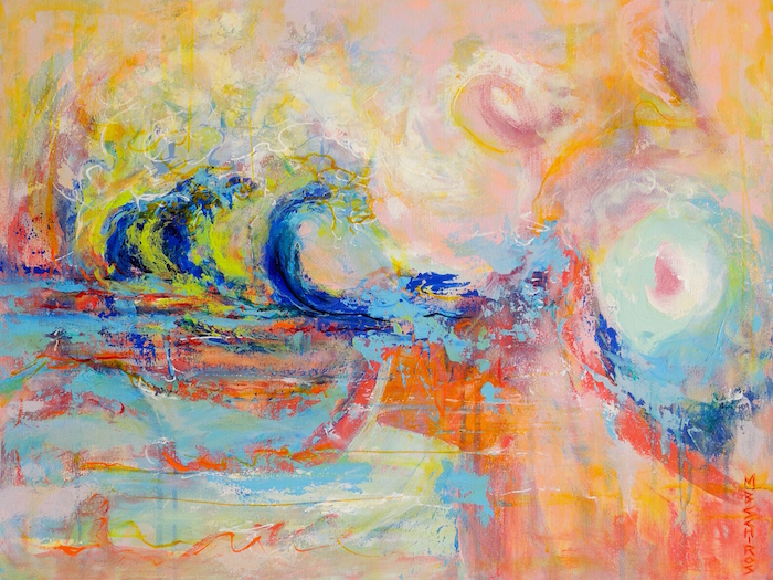
Oh and between reading there is always some painting
Here is a start and finish...gotta share art when I blog....after all this is an art blog:)

(for more art visit my web site  on Fine art )


the finish    


Tuesday, April 3, 2012

Rough start

Today's painting: "Urban Statues"
 Thought I would share my latest painting, start to finish.  I have been working more and more with palette knives and loving it.  I started this by hanging a 5 minute figure drawing on news print from a class last year on the wall for reference.  Then I picked a canvas 20 by 24 deep wrap, love these because they look so good with out framing.  Next I opened my jug of thick black gesso, a bottle of white gesso,  picked up a palette knife and went at it.  Using the knife keeps the structure loose and creates a lot of texture.  With the rough sketch done I left it to dry over night.  The next day I started adding some color.  With shape and color in place I left the painting out where I could view it and find areas to change and correct. I do spend as much, if not more time, just looking at my paintings between actual painting sessions.
   I liked the basic idea but want to pull the far right figure forward, and work with more neutral color.
As I was working on this more ideas came to mind for a couple more paintings....more to follow later.
   More art on my website  mary-schiros.artistwebsites.com
rough black and white gesso start

Midway, through.


Sunday, February 26, 2012

Drawing Ideas


When I am not painting, I usually am working with pencil and paper.
My favorite drawing pencils are Derwent Inktense, they are colored pencils that when you paint over them with water take on an intense colored ink appearance, and once dry are permanent. Places that you can find these pencils are; on line at  Dick Blick  http://www.dickblick.com/products/derwent-inktense-pencils/ and locally at Boundless Arts in Grand Blanc MI  http://boundlessarts.com/ .
      Some of the sketches I use as reference for future paintings, others are finished art, and still others become subjects for digital art.  An example is the red and orange tone drawing, that I photo copied and changed colors on my PC to see what a different version would look like.  The digital image looked so good on it’s own that it became an art work that I loaded to my web site; http://fineartamerica.com/art/digital+art/schiros/all 
For more examples of digital art check out Digital Art on Fine Art America.


original drawing

Photo shop changes to original

Saturday, February 18, 2012

Extreme Gesso


"Roots" 24 by 24 inch acrylic on canvas, by MB Schiros
Putting gesso on my canvas use to be a boring part of painting, now I love it.
I have to give Caroline Jasper  http://www.carolinejasper.com  credit for this.
Carolines workshop got me started using red gesso for painting, and is still my favorite method to start an acrylic painting.  But sometimes I just have to experiment.
   Wanting to compare results of different background starts, I use 3 different colors of gesso to paint the same subject, a simple still life.  One sheet of watercolor paper was coated with a light green gesso, the second with a blue and the last with my favorite red.
  Thought I would share the results. Each has a slightly different mood to it, even though it is the same subject painted. I have to admit I feel bolder on a red back ground than any other color.

This still life started out on a blue ground

 This started with a light green gesso

this one started with a red gesso background


       And of course I had to go one step beyond, with a multi colored gesso start for a totally different subject.  Using a 24 by 24 inch wrap canvas, that I thought I would share the beginning step and the final result with you.  Holbein makes wonderful colored gesso, and Matisse makes what is called background colors that work very well, too Hope this inspires you to try something new.
This is just the gesso canvas, using a mix or red, blue and white gesso, and yes it is turned on it's side.  I find it much easier to paint stripes this way.  To see more of my work visit Art by Mary Schiros.  And please share my blog with your friends.
The Final painting..."Roots"

Sunday, December 4, 2011

Cat Printing and Musings on Art


Cat helped printing
The Cat Artist…..I just want to share the finished work from my last post.  Also, sharing the secret of how the last print was completed.  I started with a red printing of my design and planned the second layer to be a light teal color.  I completed 12 prints that I proudly set a side to dry, when my crazy domestic Bengal cat managed to sneak into the studio and proceed to pounce on the drying pile of prints.  Six prints survived and 6 others had a variety of paw prints added.  After chasing my four legged painting partner out, I gather up the ruined prints and started to throw them out.  Throwing out art work in hard to do and I just could not let them drop in to the trash can.  So, I rolled out some fresh black ink and added one more layer.  Well, I guess my cat had a better plan than mine; the last six prints are now my favorite.

test print of the top layer
where I had planned to stop
printing over a mono print, there is a cat under that top pattern
My musing for the day….It is interesting looking at the printing I have been doing, I think the designs could be worked up in photo shop or cut and pasted from glossy magazine art.  But, the process of carving the lines and rolling the ink is what makes this art work.  Viewing the work you can see the texture of the ink, that slight rise and sheen that it creates and that is the character of relief printing.  I just hope that young artists don’t get cut short by technology and miss the process, that part of creating that comes only from working with ink covered hands.
And I always finish my printing day with a finger paint mono print from the left over ink.