Tuesday, July 22, 2014

New paint, old color

After painting for a few years most artist end up with a favorite stand range of colors they use.  I noticed that the colors I pick are primary modern colors, permanent rose, phthalo blue and green, yellow.  I have avoided classic earth pigments, for some reason.  Well I decided to give a couple a try,  Raw Sienna, and Iron oxide red and see what they are like.  Decided a landscape would be a safe subject.
8 x 10 inch oil on canvas panel, "Last Rays"
Available at DPWs
Found I love the Raw Sienna, it is a shade of yellow that I just could not get from my standard yellow like Cad. yellow.  But also found Iron red oxide is tricky,  it is a very dense over powering red that needs to be handled in small amounts.
It was interesting to try something different, hope you enjoy my view of a Great lakes shore line.
Mary
Schiros-art

Thursday, July 17, 2014

Plein air in the back yard

10 x 8 inch acrylic on canvas

Want to get outside and paint, but do not want to spend gas and time getting there?   Just take a walk around your yard there is bound to be something interesting.
 I let daisies grow around my veggie garden,  and they ended up being subject material for the day.
After painting one, it just was not enough decided to paint two more.

10 x 8 inches acrylic on canvas
Great way to spend the day,  and all the paintings sold, two to Texas and one to Arizona, guess I am not the only one that likes daisies :)

Mary
Schiros-art.com


Thursday, June 12, 2014

painting outside

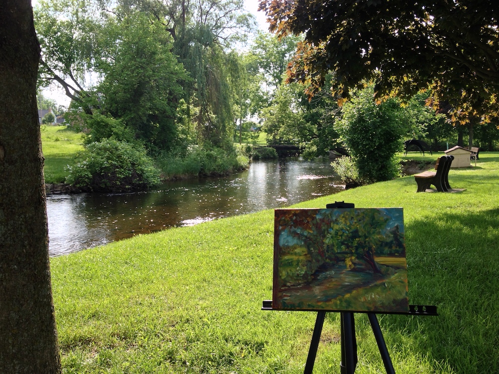
Work in process, 11 x 14 inches oil on canvas

Today I pulled myself away from the garden and went off to paint in Fenton, MI.
There is a small river that runs through town, a perfect place to paint.  Got as much paint down as I could today, almost done just a few more touches after this layer dries.  Although there were not any other painters out on this fine day, I was not alone.


Next week I will remember  to bring something for my new friends :)
Mary
Schiros-Art

Friday, May 23, 2014

How I Paint a Still-life

Pear and Silver,  11 x 14 inches, oil on canvas
                                Available at DPWs


Blue Plate Special, 12 x 16 inches, Acrylic on canvas
                                          At Bishop Gallery, FIA, Flint Mi June 2014


Thought I would share a peek at how I work on painting a still-life.  
One of the most important things I do to start, are small drawings of a still-life set up.
The drawings helps me plan the composition to work from.  Even thought I have a physical set up, deciding how I want to approach the painting really begins with the rough sketch.  
The drawings are tonal, white, grey and black, three basic values.  I do several of these drawing focusing on areas of the set up I find most interesting. Once I pick a favorite it used as a guide for my painting.


In this case I did four drawings, and ended up with two different painting. For one painting I followed the colors present in the set up and focused on the pears. 

For the another painting I went with more earth tones, and work directly from the drawings.  I also utilized my color charts to help with the colors.  

Drawing in a key part to painting because it give you a foundation to work from.  Drawing is not just for paper and graphite.  If you want to paint better, take time to draw.  Draw with pen, ink, graphite, and paint, especially paint.  Quick sketches with a paint brush helps build skill in handling a brush, and can create some very interesting pictures, also.

Mary


Friday, May 16, 2014

Mixing up some blues


Sunlit Blues, oil on canvas, 12 x 9 inchesAVAILABLE AT DPWS

Another day of taking time to learn more about the oil colors that I have.  Have found it interesting how much more I have discovered about color by doing simple color charts.  Having the charts handy when painting,  has simplified the process of picking what colors to go to when painting.  The latest chart I did because I wanted to find a green that would match a sunlit green bottle, I knew it had to be mixed but just was not sure what green to use.
   Using 7 of my favorite oils from blue to green,  I mixed the colors with whites; zinc and a titanium,   yellows,  and a complement Permanent Rose.  Found the colors I wanted and have the chart handy for future paintings.
    The chart does not have to fancy, I used Arches oil paper, the colors, and a painting knife to mix and apply the paint to the paper.  No brushes to clean, pretty easy:)


A handy idea, hope you give it try.

Mary
Schiros_Art

Saturday, May 3, 2014

Color Study

                                               
12 x 9 inches oil study

I have fallen in love with a new color:)   When resupplying some of my oil paints, I picked a new color,  Rose- Violet by Holbein.  Often when I have a few new colors I will work up color charts.
Using a color, I will make a chart of the color mixed with white, and mixed with the complement, and a mix with black, to see the values and tones I can get.  Having just picked one color the chart seemed boring to do.  So, I took my new color Rose violet, some white oil paint, and a sheet of  Arches oil paper, and did a study.
    I did the study with a video going on my pc from Bright Light Fine Art .   The video was excellent, but long, so painting while watching and listening, helped.  Double the learning, information from the a wonderful artist;  David A. Leffel, and getting to know a new color.  Nice way to spend 90 minutes.

Mary
Schiros_Art