Showing posts with label colors. Show all posts

Sunday, October 23, 2016

Ink Base

Ready for Rain, 16 x 12 inches
Acrylic inks are a great way to start a painting.  There is a loose freedom in working with ink. Thought I would share s few of the steps in creating this painting.

    First step a very quick sketch to work from using acrylic inks (magenta and yellow)

Next start an underpainting with acrylics:

When this layer is dry, start in on the details:

Letting each layer dry, it is just a bit more refining and the painting is done.
Hope you enjoyed see the steps
Thanks Mary


Thursday, September 1, 2016

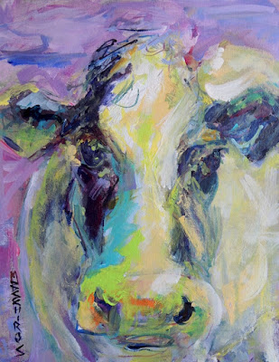
Have Fun With Color

Acrylic on Watercolor paper, 14 x 11 inches
                                                                  Click to Bid

First day of #30paintingsin30days! 


As you can see I really enjoy painting cows :)  Thought I would share a collage of them up to now.
For the 30 in 30 you will probable see a few more, along with other subjects.

Tuesday, January 26, 2016

Raining Cats and Cows

Bessie's Close-up,  14 x 11 inches, on canvas panel

"Blue Moo"  14 x 11 inches on wood panel

"Sun and Stripes"
For the last couple of days I have been finishing up some more cow paintings.  Between cats and cows I have been having a good time working with color and critters.  The 30 paintings in 30 days challenge had really kept me on a roll and it is hard to believe there is less than a week to go now.  Hope you have enjoyed this month as much as I have.   Added the latest 2 cows to my site on Artspan,  schirosart.com
   And my crazy cat is headed to a new home in New Mexico.
Mary


Friday, September 18, 2015

Oh I need this like a hole in the head...

Day 17 and 18 of 30 paintings in 30 days.
12 x 16 pastel
                                         

   I started a class about pastels this week.  Yes just what I need another media to work in.  I have tried pretty much all the other medias, watercolor, oil, acrylic, even encaustics.  I figured might as well add pastels to my bucket list.  
   It is strange pretty much like drawing but with color, (and lots of dust).  Not sure what to think of it yet, maybe because there is so much to learn.  May like may not, time will tell.

   Also thought I would share for one of my daily paintings a card that is going out with a painting that I just sold.  (Figures this counts as one of the 30 in 30).


Tuesday, September 23, 2014

Finding time to paint

Started this early with a rough acrylic underpainting.  Working with gesso and some magenta color is a quick and loose way of putting down a composition idea.
Purple Passion, 8x8 inches, Acrylic on canvas panelAvailable at DPWs
After canning up 6 quarts of garden veggie soup, I went back and added the green leaves and darker accents.  This was a multi tasking day:)
Mary

Monday, September 22, 2014

Oil painting today....

10 x 8 inches, oil on panel, "One In One Out"Available at DPWs
     Planned to do a lot more on finishing this paintings today,  but after spending some time just sitting and looking at it, decided there was not much I wanted to change.   As a painter I spend much of my time when painting just looking.  Looking at the subject, looking at the painting.  Think that is what I love about painting from life, there is a kind of meditation that goes with it.
    I realized that I really liked the soft feel this painting has so just a bit of glazing to bring up the color of the roses was all it needed today to call it done.
   Did the under painting with a new color Greenish umber by Utrecht,  really like the color for laying out the composition and also to create a dark neutral color for dark accents.

Mary

Tuesday, September 16, 2014

Day 16 of 30 paintings in 30 days

Some flowers from my imagination today....

"Red on Violet"  8 x 8 inches, Acrylic on gallery wrap canvas.AVAILABLE AT DPWS
Wanted to play with some color and lines today.  Love painting on Gallery wrap canvas because you can carry the painting on to the sides, lets you have more than just a straight on view of the art,  And you do not have to frame it :)
Past the half way mark in the 30 in 30 challenge, feels good.
Mary

Saturday, September 13, 2014

Day 13, Thirty paintings in thirty days

Another color threesome....
"Lime Light"  Acrylic on watercolor paper,  14 x 11

        I am finding it interesting how much variation in color can be done with just 3 colors and white.
The three today are Holbein Compose Rose,  Daniel Smith French Ultramarine, and Sennelier  Bright Yellow green.  
     The Bright yellow green is one of my favorites and I like the Sennelier brand the best.  There are colors that I will get only from one brand, just because that company seems to me to make the best version.  Cad. Orange I will only buy the Utrecht brand,  Utrecht produces many pure pigment colors.  Old Holland has a Violet Grey I just love. and Sennelier's yellow green is just right.  Some companies give odd names to colors, for example Holbein Compose Rose is actually a Naphthol red, and the yellow green is a mix of pigments.  If you want a quick place to see what the true pigment is in a color Dick Blick lists a tab "pigment info" for most of the colors and brands they sell, it is really helpful and I use it a lot, just for reference.
   The more you learn about color the easier it is to work with.
Mary

Friday, September 12, 2014

Some more red...

Finished up this painting this morning.....  Day 12 of 30 in 30
24 x 18 inches, acrylic on canvas, "The Bath"Available; original of print at FineArtAmerica

I know I am posting this late, but my day was busy with some of my favorite things: painting in the morning,  gardening in the afternoon, then canning in the evening.  Yes I like canning, something cool about growing your own food, putting it up for the Winter.  Kind of old fashioned but thats me.
    This painting I started at the open house for the Flint Institute of Arts, and it was painted with the same colors of the painting from yesterday. I worked on both paintings at the same time.  I find that working on 2 paintings will keep me from over working one.  I  taped several  1 and 2 minute gesture drawing on the wall in front of my easels and used them for reference.  One suggestion I can make is, if you ever have the chance to take life drawing please do.  There is no other form of drawing that will fine tune your skills as much as having to draw the human figure from life.
Mary

Tuesday, September 9, 2014

Color theme

"Tools of the Trade",  Acrylic 14 x 11 inchesAVAILABLE AT DPWS
Today my three colors are:Ultramarine Blue (Golden brand), Nickel Titanate Yellow (Daniel Smith), and Quinacridone Coral (Daniel Smith).  Picked these three just because they are colors I like, pretty simple reason, but why not? Thought I would mention the brands because different brands of paint are a little different.  Yesterday the Viridian green I used was Liquitex and I think it is a little less blue than other brands.
When I am planning these "harmony paintings" I pick the colors but also decide on one color being a dominate color, in this case it was the blue.  Probably will do another but using a different one of the group as dominate.  Called this Tools of the Trade, wine and paint brushes, why not:)

Mary

Monday, September 8, 2014

Second week of 30 paintings in 30 days

Acrylic on watercolor paperAvailable at DPWs
    Starting a a new theme this week.  Got the idea for this week from Mary Maxam .
The last show Artists helping artists, had 50 tips and one of them was picking just 3 colors for painting, ( a limited palette) to create color harmony.  Love the idea and plan to pick 3 different colors each day this week to paint with.
  The focus this week is color.  I will be picking 2 or 3 colors and white and painting.  Today's colors are Viridain, Indian yellow, and Cadmium red light.

This should be a fun week.
Mary

Thursday, September 4, 2014

Day 4 of 30 paintings in 30 days

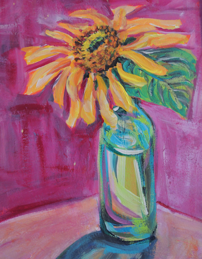
Decided to go a little more abstract (just a bit) with my sunflower....
!4 x 11 inches, acrylic on watercolor paper.
Can not decide if I am having more fun painting the sunflower, or painting the glass:)
Mary
Schiros-art

Tuesday, July 22, 2014

New paint, old color

After painting for a few years most artist end up with a favorite stand range of colors they use.  I noticed that the colors I pick are primary modern colors, permanent rose, phthalo blue and green, yellow.  I have avoided classic earth pigments, for some reason.  Well I decided to give a couple a try,  Raw Sienna, and Iron oxide red and see what they are like.  Decided a landscape would be a safe subject.
8 x 10 inch oil on canvas panel, "Last Rays"
Available at DPWs
Found I love the Raw Sienna, it is a shade of yellow that I just could not get from my standard yellow like Cad. yellow.  But also found Iron red oxide is tricky,  it is a very dense over powering red that needs to be handled in small amounts.
It was interesting to try something different, hope you enjoy my view of a Great lakes shore line.
Mary
Schiros-art

Friday, May 23, 2014

How I Paint a Still-life

Pear and Silver,  11 x 14 inches, oil on canvas
                                Available at DPWs


Blue Plate Special, 12 x 16 inches, Acrylic on canvas
                                          At Bishop Gallery, FIA, Flint Mi June 2014


Thought I would share a peek at how I work on painting a still-life.  
One of the most important things I do to start, are small drawings of a still-life set up.
The drawings helps me plan the composition to work from.  Even thought I have a physical set up, deciding how I want to approach the painting really begins with the rough sketch.  
The drawings are tonal, white, grey and black, three basic values.  I do several of these drawing focusing on areas of the set up I find most interesting. Once I pick a favorite it used as a guide for my painting.


In this case I did four drawings, and ended up with two different painting. For one painting I followed the colors present in the set up and focused on the pears. 

For the another painting I went with more earth tones, and work directly from the drawings.  I also utilized my color charts to help with the colors.  

Drawing in a key part to painting because it give you a foundation to work from.  Drawing is not just for paper and graphite.  If you want to paint better, take time to draw.  Draw with pen, ink, graphite, and paint, especially paint.  Quick sketches with a paint brush helps build skill in handling a brush, and can create some very interesting pictures, also.

Mary


Friday, May 16, 2014

Mixing up some blues


Sunlit Blues, oil on canvas, 12 x 9 inchesAVAILABLE AT DPWS

Another day of taking time to learn more about the oil colors that I have.  Have found it interesting how much more I have discovered about color by doing simple color charts.  Having the charts handy when painting,  has simplified the process of picking what colors to go to when painting.  The latest chart I did because I wanted to find a green that would match a sunlit green bottle, I knew it had to be mixed but just was not sure what green to use.
   Using 7 of my favorite oils from blue to green,  I mixed the colors with whites; zinc and a titanium,   yellows,  and a complement Permanent Rose.  Found the colors I wanted and have the chart handy for future paintings.
    The chart does not have to fancy, I used Arches oil paper, the colors, and a painting knife to mix and apply the paint to the paper.  No brushes to clean, pretty easy:)


A handy idea, hope you give it try.

Mary
Schiros_Art

Saturday, May 3, 2014

Color Study

                                               
12 x 9 inches oil study

I have fallen in love with a new color:)   When resupplying some of my oil paints, I picked a new color,  Rose- Violet by Holbein.  Often when I have a few new colors I will work up color charts.
Using a color, I will make a chart of the color mixed with white, and mixed with the complement, and a mix with black, to see the values and tones I can get.  Having just picked one color the chart seemed boring to do.  So, I took my new color Rose violet, some white oil paint, and a sheet of  Arches oil paper, and did a study.
    I did the study with a video going on my pc from Bright Light Fine Art .   The video was excellent, but long, so painting while watching and listening, helped.  Double the learning, information from the a wonderful artist;  David A. Leffel, and getting to know a new color.  Nice way to spend 90 minutes.

Mary
Schiros_Art

Friday, March 28, 2014

Oil on canvas, 20 x 16 inches
                                                                               Click here to buy

One of the advantages to oil and acrylic paint is how layering can be used.  Thought I would share this painting, where it started to how it was finished.   I started with a textured grey tone gesso, a slightly rough patchy texture, when it was dry sketched in my idea with vine charcoal, and white pastel.  The first layer is a colorless, using only the light and darks as my guide. 
layer one, shades of grey
With second layer I decided on my color scheme and added my first layer of colors in a light painting of oil color.  The finish at this point is fairly easy, building up the colors, redefining my lights and darks.
First layer of color


    It is amazing how colorful a painting can be created form just a grey tone under painting.

Mary


Tuesday, March 11, 2014

Finding Ideas


                                           On the available paintings tab of this blog

Wanted to spend some time today sharing some helpful links.   There are times I know I just need something to give me a kick in the rear to get going.  Having some sites on the web to spark ideas is wonderful.  I have some old favorites and a new site (at least for me) that are great to go to.

The idea for the painting on today's post came from a site I just discovered;
paintmyphoto.ning.com  This is a site photographers and painters get together.  Photographers offer photos for painters to paint,  how cool is that!  You can as a painter post your paintings there also, and there are a number of forums for tips and ideas.  I have posted both paintings and some of my photos for other painters to use.

One of my old favorites,  is a web site called Wet Canvas  This site has activity for all media, and a great photo reference library.

Also, if you need an idea or challenge Daily Paint Works isn't just for selling and buying art, (although I highly recommend a little shopping there), it also has challenges, contests, and tutorials.

And one more site I just found for painters wanting to understand color;  Hand Print
This has information on color pigments and more.  I haven't finished looking around the whole site but use it mainly for pigment detailed information.

Hope these sites help you out, and let me know of any others that are good too.

Mary
Thursday, January 23, 2014

Only Color

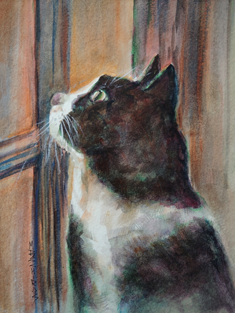
Thought I would do one of Daily Paint Works challenges today as part of the 30 paintings in 30 days.
This was really suppose to be painted in black and white but, when I do watercolors I do not use black.  I have always mixed my own black, do not even own a tube of black watercolor paint.
The only time I use black with watercolor is if it is mixed media, ink and watercolor because the ink is black.  But the mixes I came up with still worked pretty well ......
Watercolor, 14 x 11 inches, "A Window View"
Available at DPWs


Saturday, January 11, 2014

Two Color Theme

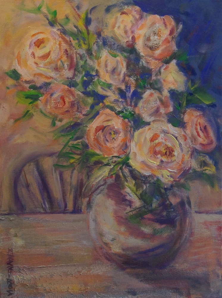
Today decided to follow up with another painting using the 2 complements blue and orange.
Orange Roses,  Oil on canvas, 16 x 12 inches

AVAILABLE AT DPWS
For me picking the colors I want to work with, and keeping the colors to a limited number, makes painting more enjoyable.  Used C.A.S. oils, ocean blue, ultramarine blue, Cad.yellow,  Cad. orange, and white and a  touch of permanent green   Love how opposite colors look so bright next to each other, and also when mixed make the most beautiful grey.  Adding this to the 30 paintings in 30 days challenge.

MARY