Showing posts with label background color. Show all posts

Thursday, September 18, 2014

Day 18 ...already

I started the underpainting for this yesterday, and enjoyed finishing today painting at good friends studio.
"Tes for Two", Acrylic on canvas panel, 8 x 10 inchesAvailable at DPWs
This one of my many Teapots, ( I tend to collect them).  I did one underpainting in acrylic, and a second underpainting in oil that I may work on another day.  I always find it interesting how different oils and acrylic paintings look.  So it will be interesting to compare the two.

This is how this one started....

I like using orange for underpainting (adds a bit of a glow), also wanted to put down an idea for composition.   I change a bit from start to finish but still very happy with it.

Mary

Friday, September 12, 2014

Some more red...

Finished up this painting this morning.....  Day 12 of 30 in 30
24 x 18 inches, acrylic on canvas, "The Bath"Available; original of print at FineArtAmerica

I know I am posting this late, but my day was busy with some of my favorite things: painting in the morning,  gardening in the afternoon, then canning in the evening.  Yes I like canning, something cool about growing your own food, putting it up for the Winter.  Kind of old fashioned but thats me.
    This painting I started at the open house for the Flint Institute of Arts, and it was painted with the same colors of the painting from yesterday. I worked on both paintings at the same time.  I find that working on 2 paintings will keep me from over working one.  I  taped several  1 and 2 minute gesture drawing on the wall in front of my easels and used them for reference.  One suggestion I can make is, if you ever have the chance to take life drawing please do.  There is no other form of drawing that will fine tune your skills as much as having to draw the human figure from life.
Mary

Thursday, September 11, 2014

Always say yes

A tip I have learned along the way....
   When ask to participate in an art event, (that is free and does not involve giving away your work),
always say: "Yes, I would love to!"  and say it with a big heartfelt smile.  Now after your turn and walk away with that smile on your face, you can then panic, and think now what!  There is nothing that will get you to your easel and painting, faster than having a event to be in.  
   Wed. I had the fun of being one of the active painters, on display at the Flint Institute of Arts, Art school open house.  After jumping in and painting in public for a while now, I have learned it is very rewarding.  I get to do something I love, be around people and paint, just doesn't get any better than that.  Now if your thinking I just can not paint in public, you do not know until you try, and if you don't try you will never know...(kind of  loop there).  Yes it is scary the first time, and yes you may make mistakes, but people don't care, they will enjoy it even if you make a mess...really!
   Anyways, here is one of the 2 paintings from the open house...
28 x 22 inches, Acrylic on CanvasAvailable for sale or prints at Fineartamerica.com
Counting this as painting 11 of the 30 paintings in 30 days challenge, because I did finish it up today.
Also, it fits with this weeks theme, limited palette, but I did use 4 colors:  Capital Orange by Matisse (looks like a cad.red light) and Haymarket ( looks like an ochre yellow) also by Matisse.  These to are called background colors, because they are opaque and mat.  I love these paints because you can put down a lot of rich color quickly.  The other 2 colors were Golden's Ultramarine blue, and Holbein Aqua blue.
Happy painting
Mary
Painting and chatting, and two easels, hey I can multi-task :)

Wednesday, September 10, 2014

Three more colors...

"Green Perch"  Acrylic on watercolor paperAvailable at DPWs
Today was a very busy day, but did one more color theme this morning.  Today I used a very scary color; Phthalo Blue, it was Daniel Smith brand, but brand really does not matter, Phthalo is a strong staining color by any brand.  The other two colors were Hansa Yellow Deep, and Quinacridone Violet both Daniel Smith brand.  The yellow was a strong enough color to mix with Phthalo, but I was surprised that the violet as transparent as it was.  I also use white, but do not count that as a color, just a color adjuster.
Sparrows were hanging on the sunflower stems, in between fighting over seeds, so this was a fast little painting.  For some reason the birds were not very good models, may have been because my cat was also watching them.
   After getting my morning painting done, I spent the afternoon at the Flint Institute of Art for an open house,  painting of course :)  So, all in all, this busy day was a lot of fun.  I plan to share the open house paintings tomorrow.
Mary

Tuesday, September 9, 2014

Color theme

"Tools of the Trade",  Acrylic 14 x 11 inchesAVAILABLE AT DPWS
Today my three colors are:Ultramarine Blue (Golden brand), Nickel Titanate Yellow (Daniel Smith), and Quinacridone Coral (Daniel Smith).  Picked these three just because they are colors I like, pretty simple reason, but why not? Thought I would mention the brands because different brands of paint are a little different.  Yesterday the Viridian green I used was Liquitex and I think it is a little less blue than other brands.
When I am planning these "harmony paintings" I pick the colors but also decide on one color being a dominate color, in this case it was the blue.  Probably will do another but using a different one of the group as dominate.  Called this Tools of the Trade, wine and paint brushes, why not:)

Mary

Monday, October 14, 2013

Over and Under


I have the bug to paint some dramatic sky scenes.  I also want to try some new techniques.  After doing several black and white studies, decided to start with the one I liked best.  Did an under painting, but instead of the traditional earthy umber color, used black, red and gold.  

16 x 20 acrylic gesso on wood panel


Almost stopped here, really love the abstract look!  But decided I can always do more, so laid in the over painting.  The under painting was done with colored gesso, the top in oil.  The painting is now resting in a spot I can view it and decide if more needs to be done or not.

One thing I have decided there is a series here…..
 

 Mary

Thursday, September 26, 2013

Surprise Ending

Day 26 of 30 paintings in 30 days, and it started out  rough, but ended ok...
Acrylic, "A Pose",  10 x 8 inches on canvas panel
                                                                                         Available at DPWs
This painting started out life as a tree, a simple tree.  What started out as a simple painting tumbled out of control.  Got up early and had a small sketch I planned to quickly paint for today's painting.  It started out well but did that mistake that happens, went too far and lost the original idea.
where I started
Still interesting
A point to far

Should have stopped here, I wanted it abstract and colorful,  did I?  No...
Got to this point and just wasn't happy.  While it was still wet dumped some pinks and iridescent paints on it, scraped in some texture, and start over.  Love what I ended up with, so sometimes a failure and change of direction is a good thing!
Mary
Schiros_Art

Wednesday, September 18, 2013

Different method, different beginning


Acrylics,  watercolorand oil paints are all paints, usually applied with a paint brush, a like?  Yes and no.  
The mediums to blend them are different, the way they flow onto the canvas have very different feels.  But also the very start of a painting can be very different depending on the paint you plan to use.
With oils I usually tone a canvas and start the painting neutral in color, think of only the light and dark areas.
With watercolor the surface is white and first colors are soft washes, leaving my lightest areas bare with the white of the paper showing.  
With acrylic, there is a wildness to the beginnings of a painting, often a bold color, wild splats of paint, that eventually gets molded into something fairly normal.  The last couple of paintings actually began life as the previous day's paint palette.  I used a canvas panel to mix my paint one. At the end of the painting section the last colors are used to shape an idea out on the panel to work on at the next section.
   Palette from yesterday....
               This is where today's painting started.
And this is where my panel being used for a palette ended, which might be where I start a new painting.
Mary
Schiros_Art


Monday, May 13, 2013

From Pencil to Paint

20 x 16 inches oil on canvas


To follow up on my last post, thought I would share the first painting from my last sketching session.  I picked the drawing I liked the best, then drew a grid over it to help decide the lay out.
 From that I sectioned off the area I wanted to redraw on my canvas.  Then I did a quick acrylic painting to use as an under painting.  For the under painting I used Matisse back ground acrylics they are matte and have more tooth that regular acrylics.  When the under paint was totally dry (gave it 24 hours), I finished it in oil.  Used Weber water mixable oils starting with brush work then finished with a palette knife for a little more texture. 


 Mary

Friday, March 22, 2013

Preparing for Abstracts

"Secrets"  Mixed media 24 x 18  inches
  
"Rust and Steel" Mixed media


It often appears that an abstract art work is quick and spontaneous.  Sometimes abstracts do happen that way.  But often there is a lot of preparatory work going on behind the scene. 
For most of the abstracts I do in watercolor or acrylic I use some collage.  For collage I like to texture and design my papers.  This could involve textured artist tissue paper with gesso and paint, there times I use ink, and solvent on found papers, to get usual effects.
To apply my collage parts I use a mix of gloss and matte medium, fluid for thin papers, and gel for heavier ones.
The process of textured the papers to use take a few days and layering then into the work takes several days also, because it is best to layer thinly allowing each layer to dry before apply the next.  Any painting between layers and at the finish should completely day before finishing with varnish.
Yesterday I spent the whole day just making collage papers. Today I am sorting and figuring out which ones are best to use. Next will be laying them out on a gessoed panel and creating the basic design. That is the process I used in the paintings that I am sharing above.  
  
piles of ink textured paper getting sorted

close up of one paper

another example of paper
 Mary

Monday, February 18, 2013

Light and Dark

Red Head 1, Acrylic on paper 12 x 16 inches


There is no picture with out light, and the only way to see the light is by the contrast to dark.  Such a simple fact but so easy to forget when color choices come in to play.
    Sometimes I just need to remind myself of that and work on a painting focusing only on the lights and dark.  And that is what I did with this figurative.  I did not abandon color but used it in connection to lights and dark.  A good practice to do once in awhile, thought I would share.

Mary
 

Friday, December 14, 2012

What you see and more

Red Vase III,  16 x 12 inches, Acrylic on 300 lb watercolor paper


     I will often mention that the painting I enjoy the most is painting what I see. 
That can be outside or a set up on a table.  But having said that, those paintings will not be photo like images in paint of what I see.  I may paint the subject, but change the color, mood, even leave out some of the content.
     This is an example, the set up contained more objects than I thought were needed.
The color changes were due to necessity, because on site I had a limited choice of acrylic paint colors.  But, I think that a limited color range is just a fun puzzle to figure out, and enjoyed this one even more because of it.
   So remember you’re the artist and that give you “artistic license”, use and enjoy that license.
Nice set up, but like my version better;)

Mary
Schiros_Art

Monday, December 3, 2012

Finger Painting

        Bid on at DWP


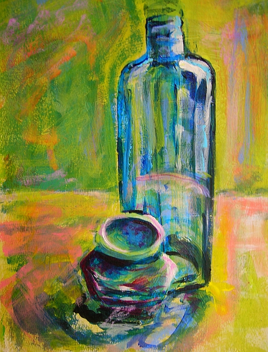
     This small still life really did start out as “finger painting”.
I often start a painting by putting down a colored gesso as my base to paint on, usually orange.  But in this case I used a light wash of red oil paint, thinned out with some odorless mineral spirits.  To do this, be careful to not get the paint so diluted that it actually runs, just thin enough to lift off easily.  The panel I used is an Ampersand gessobord which is ready to paint on.
      I covered the whole panel with a light coat of red, then used a soft cloth over my finger and pulled off the shape of the glass and bottle, especially the high light areas.  After that I mixed up a slightly thicker blue to put in the dark outlines and shadows, still mainly using my fingers and a soft cloth.


     With this paint being thin and wet it is easy to make corrections to shapes at this time, and really what I am looking for at this point is the over all masses of the composition.
    I let that dry over night and the next day finished the painting, this time using a brush and thicker layers of paint. 

Mary
 

Sunday, November 18, 2012

A Flower for You

6 x 6 inch oil on canvas

                                     Available on DPW


I thought I would share the process of making this painting.  This is another in my small character still life paintings.  I have a collection of odds and ends, including some beanie babies that I use for set ups.  This one is a simple set up just the stuffy and a flower.  I set up the objects to paint on a surface that has some shine, so I get reflection and shadow to incorporate into the painting.  I use a goose neck lamp to get a direct light on the set up, moving the light around until I like the shadows.
Set up to paint


Then I do a quick drawing on paper as a reference for the painting.  I do not draw on my painting surface.  
quick sketch

Next, I do a rough, almost abstract under painting, using a dark oil color thinned down a lot with odorless thinner. In the under painting I am looking for a few main things; lights, shadows and lost edges.  The lost edges are places the outline of the object merges with either the light or dark around it.
The thinned paint is easy to correct because it can be wiped off if needed and adjusted.
not the best photo but here is the under painting


After that dries over night I proceed to finish the painting with color and details.  This isn't the way to do all oil painting but this method works well when doing still life painting for me.


 Mary

Sunday, September 23, 2012

Second Ink

   
Acrylic on paper, 20 x 16 inches


     Still working with the quick ink sketches I posted last time.  This is the second one.
Worked this up on red gessoed watercolor paper, and pick only primary colors to experiment with.
This is just one option, and I plan to try different variations to the way I paint it, but you need to start some where.  While I was painting, the thought of  "disconnected  conversations" kept popping into my head. I may later follow up on that idea.  It is always a good idea to jot down the ideas that can give a future work a direction to follow, that can be as important as the sketch.
Hope that sharing this process, encourages new ideas and gets painters to get those brushes going:)


Sunday, September 16, 2012

The Process

Oil 16 x 12 inches
Ink 7 x5 inches


    Art is always on my mind.  And the only way to deal with an obsession like that is to learn to live with it.  When the TV is on, I am doodling, when I go out there is always a small sketch pad with me.  Even when I get ready to sleep there is a sketch pad near the bed, for those times a picture pops in my brain just as my eyes are closing.
     Because I have learned to grab ideas when ever they happen, I always have a source to work from when real time allows.
   Thought I would share the start of one of these ideas.  The sketch is on a small 5 x 7 drawing pad, one of many I did while pretending to watch TV with my husband.  When I had the time to get some oil paint out, instead of sitting and trying to think of something to paint, I accessed the nearest sketch pad and picked the first one that caught my interest.
   The Painting is on watercolor paper 140 lb that was gessoed with orange colored gesso.  I keep a small pile of prepped paper handy.  This is a working idea now.  The small painting is complete, but also may lead to a larger work.  

Tuesday, April 3, 2012

Rough start

Today's painting: "Urban Statues"
 Thought I would share my latest painting, start to finish.  I have been working more and more with palette knives and loving it.  I started this by hanging a 5 minute figure drawing on news print from a class last year on the wall for reference.  Then I picked a canvas 20 by 24 deep wrap, love these because they look so good with out framing.  Next I opened my jug of thick black gesso, a bottle of white gesso,  picked up a palette knife and went at it.  Using the knife keeps the structure loose and creates a lot of texture.  With the rough sketch done I left it to dry over night.  The next day I started adding some color.  With shape and color in place I left the painting out where I could view it and find areas to change and correct. I do spend as much, if not more time, just looking at my paintings between actual painting sessions.
   I liked the basic idea but want to pull the far right figure forward, and work with more neutral color.
As I was working on this more ideas came to mind for a couple more paintings....more to follow later.
   More art on my website  mary-schiros.artistwebsites.com
rough black and white gesso start

Midway, through.


Saturday, February 18, 2012

Extreme Gesso


"Roots" 24 by 24 inch acrylic on canvas, by MB Schiros
Putting gesso on my canvas use to be a boring part of painting, now I love it.
I have to give Caroline Jasper  http://www.carolinejasper.com  credit for this.
Carolines workshop got me started using red gesso for painting, and is still my favorite method to start an acrylic painting.  But sometimes I just have to experiment.
   Wanting to compare results of different background starts, I use 3 different colors of gesso to paint the same subject, a simple still life.  One sheet of watercolor paper was coated with a light green gesso, the second with a blue and the last with my favorite red.
  Thought I would share the results. Each has a slightly different mood to it, even though it is the same subject painted. I have to admit I feel bolder on a red back ground than any other color.

This still life started out on a blue ground

 This started with a light green gesso

this one started with a red gesso background


       And of course I had to go one step beyond, with a multi colored gesso start for a totally different subject.  Using a 24 by 24 inch wrap canvas, that I thought I would share the beginning step and the final result with you.  Holbein makes wonderful colored gesso, and Matisse makes what is called background colors that work very well, too Hope this inspires you to try something new.
This is just the gesso canvas, using a mix or red, blue and white gesso, and yes it is turned on it's side.  I find it much easier to paint stripes this way.  To see more of my work visit Art by Mary Schiros.  And please share my blog with your friends.
The Final painting..."Roots"